COLOR GUIDE
WITH DECORATOR SOFIA TRETOW
How does color affect you and your home? And how do you spread energy and harmony through your decor? Let the decorator Sofia Tretow show how you can pair color and style. Sofia is a colorful stylist from Stockholm, with a passion for extravagant and romantic decor.

“In my family color is a matter of constant debate. Often I discuss with myself, but sometimes I get the company of my husband. Since 1995, he has decided to always-on principle – to always vote for the opposite. I want it quiet and soft; while he regularly announces that white with red splashes of paint is the only option to consider. And you know, there are some undeniable truths in interior design. And life. One of them is that when you decorate with your spouse or get input from your neighbor, one of you will always be wrong, and it's not you. "
TO CHOOSE THE RIGHT HUE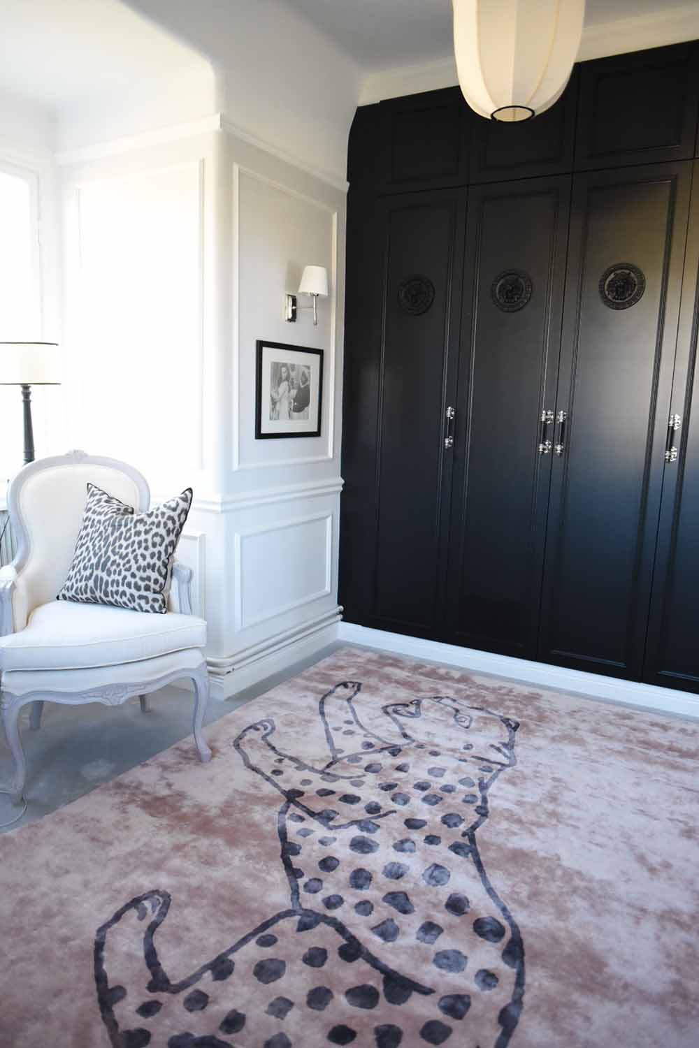
“Coloring is really about something as vague as a concoction of the various emotions that colors evoke. Whether you like certain nuances or not is a deeply individual question. But, I would say, it's when people invite themselves to your home - for a chance to pat your beautiful green walls let’s say- even when you are grumpy and not the best companion, that you know you've succeeded with your interior. "
WHEN YOU CHOOSE COLOR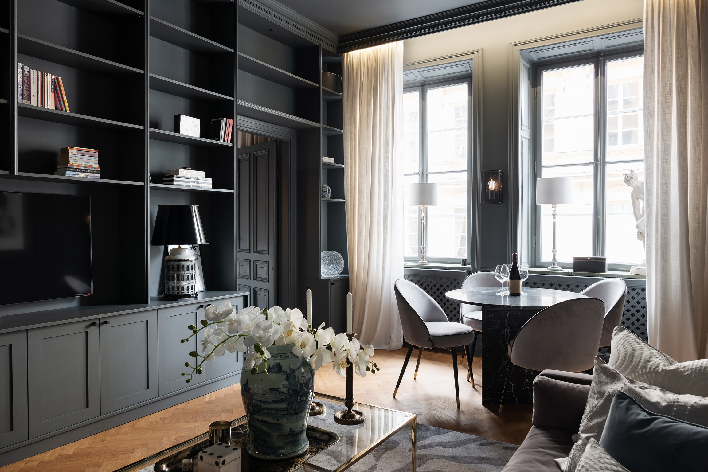
”A well-composed mix of colors becomes a recipe with just-right salty and sweetness. When I am approached by a new customer who cannot quite put his finger on what it is that makes his home uninviting, it almost always the color range that is off. ”
FEEL HOW THE COLORS AFFECT YOU
”To get the hang of it in your own home, start by feeling the colors you are drawn to. Get inspired by whatever you like - a rug, an armchair, a painting, a beautiful flower or a picture. But remember it may be one thing to look at a beautiful picture, and a whole other thing when you see the color painted in a big room, or on the cover of a sofa. Consider seriously and let your mind decide whether it is an uplifting hue you can live with, or if it just works on Instagram. ”
MAKE SURE THE FLOW IS RIGHT
“When you have picked out some colors that make you feel happy, calm and inspired, you should put them next to each other. Can you see a "flow" between them; will the transitions be comfortable? Do the colors appear to have a mutual connection? Then you have found the right mix."
THE LIGHT - A KEY FACTOR
”When it's time to choose which room to pair with each color, you should note in which directions the windows are placed. To harden it all: If the light comes in from the north, the room will be shady and all the colors will be a little blue and colder, with harder contrasts than if it is facing south. A southern room can withstand most colors, while a north room needs more softness and warmth. In the east and west-located rooms, the light changes drastically during the day, with one direction lit up by dawn and the other by dusk.”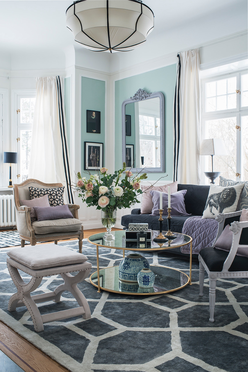
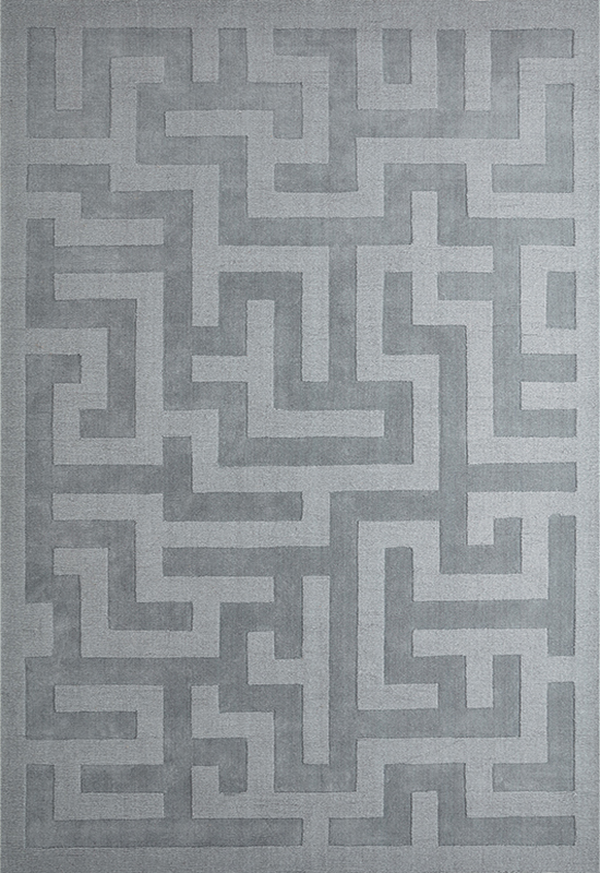
”The color in the picture above -" Teresa's Green "from Farrow & Ball - goes from turquoise to green, to mint green during the day, and gives me this completely changed room which adds a feeling of warmth and friendliness. For the mild pastel-colored color scale to get a little bit of bite, I added the Entrance carpet in Elephant Gray, which with its graphic pattern and neutral color is intended to give the pastel frames and create interest.”
BE INSPIRED BY PATTERNED RUGS
LET THE DETAILS DECIDE
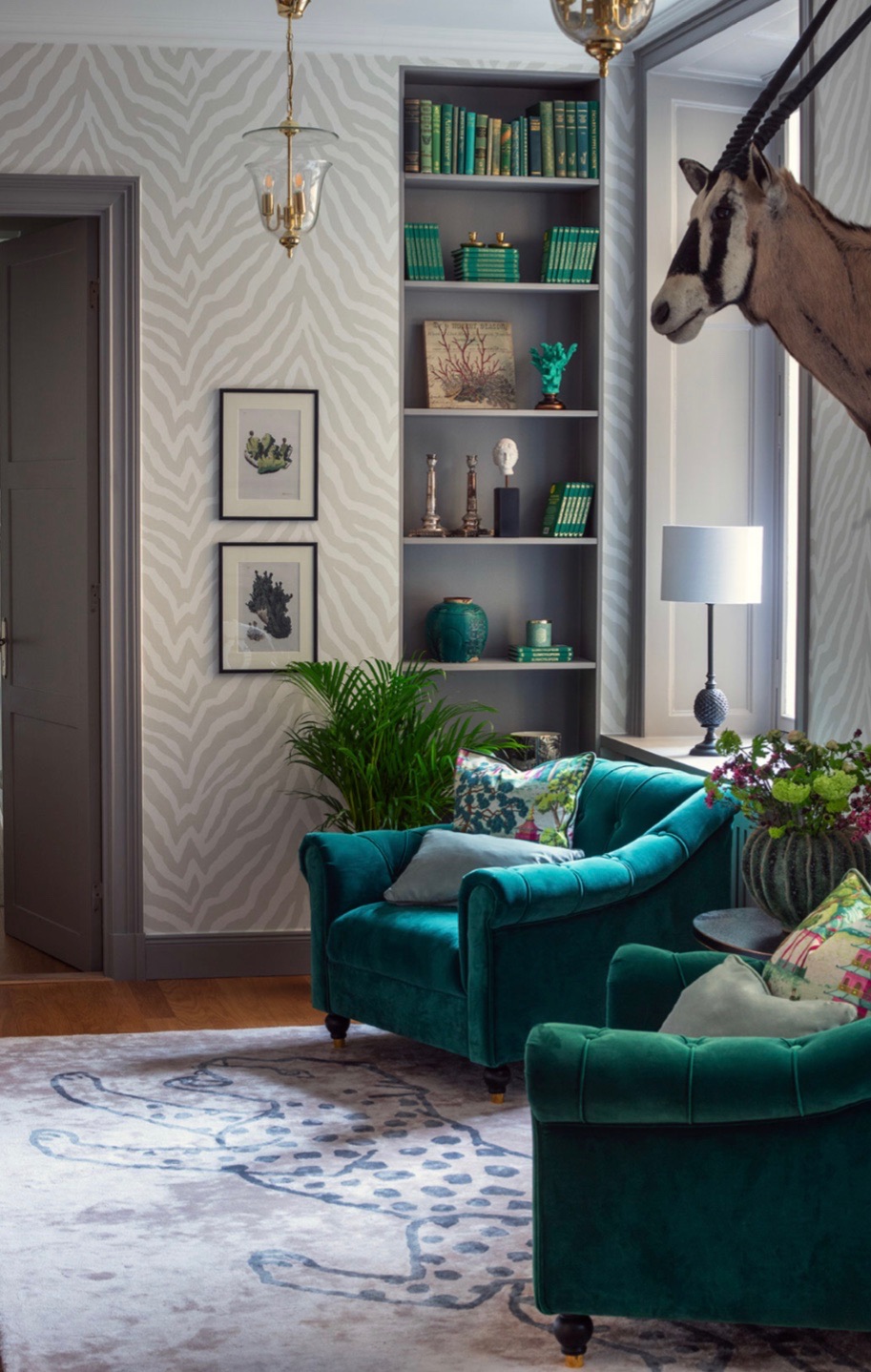
”The room in the above picture is perceived (despite the gray patterned wallpaper) as“ the green room ”, just because enough green accents have been added. The deep green in armchairs, plants and the bookshelf details is softened by the soft gray-pink carpet Cheetah - one of my absolute favorites - and between them lies the gray in the wallpaper and the carpentry as a bridge.”
TIP: CREATE A BOND BETWEEN THE COLORS
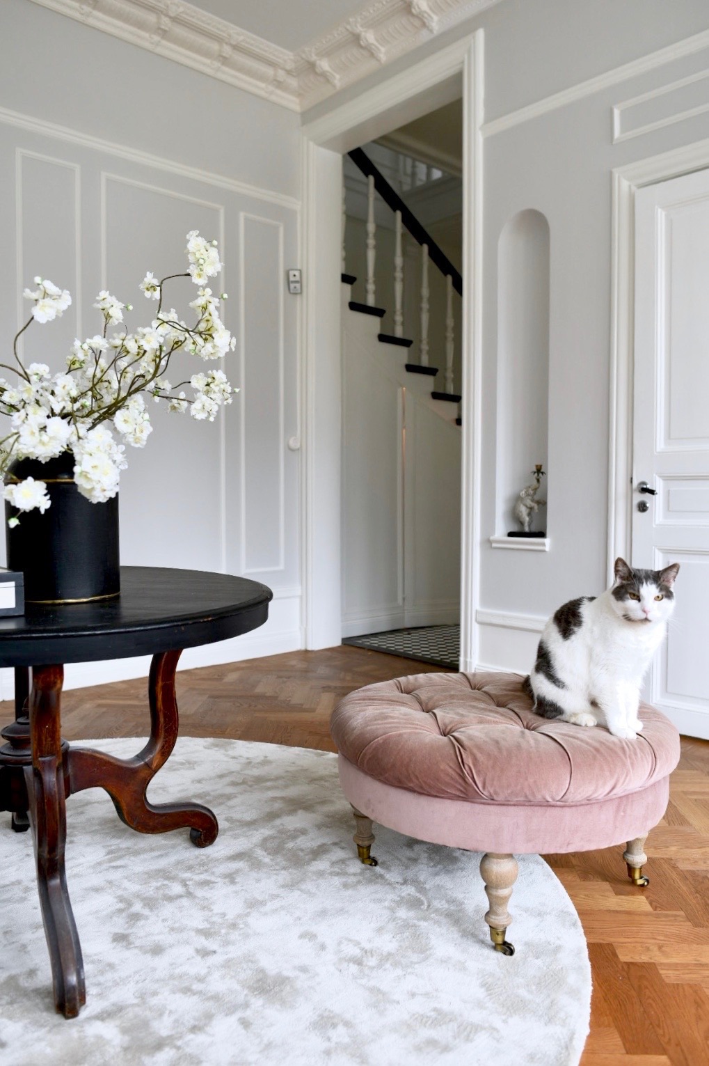
NEUTRAL COLORS CREATE CALM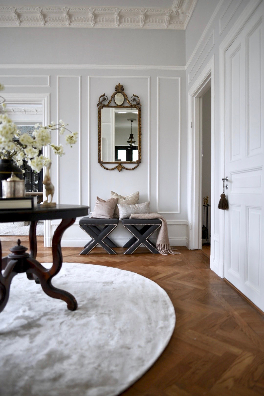
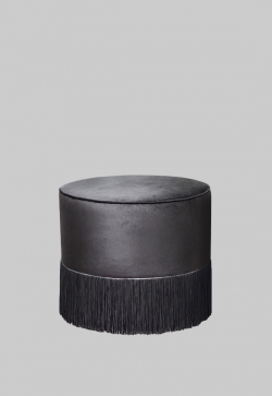
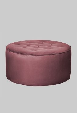
”A neutral painted rum, a discreet color accent in the form of a gray-pink ottoman, as well as graphic elements and a decor-conscious cat who tend to show up a bit whenever he likes. The Solid Viscose Rug in the color Francis Pearl reflects the wall color in the picture and becomes a contrasting stroke to the black table - and thanks to the color of the rug, the focus shifts from hard to soft in a balanced way.”
SEE ALL VISCOSE RUGS
READING TIP: INTENSIVE COLOR MEETS NEUTRAL
DON'T FORGET THAT COLORS AND FEELINGS ARE INDIVIDUAL
”My little tips are just an introduction to color therapy when you can't quite put your finger on what feels wrong.
Fingers crossed that it has been helpful!
Sofia Tretow"
Photo of: Sofia Tretow, Anne Nyblaeus, Jesper Florbrant, Cecilia Möller.
SOFIA'S FAVORITES
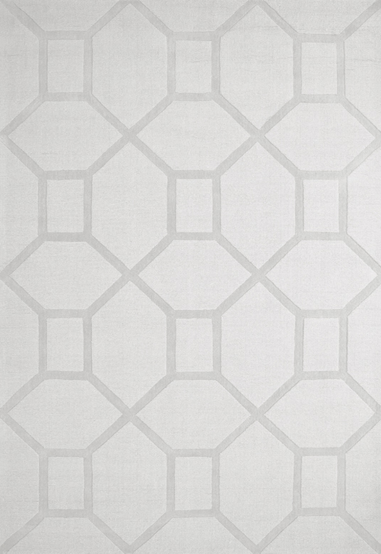

 BYZANTINE Wool rug €890 |
.jpg)
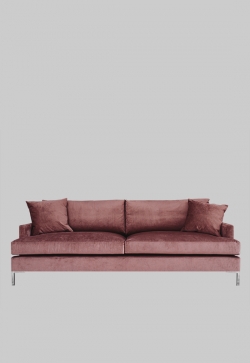
READ MORE: SOFA-GUIDE
Want more advice and tips? Email a picture of your home with your question to styling@layeredinterior.com or give us a call and we will give you personalized interior consultation without charge.